While metal business cards are distinctive in there own right, adding a splash of color can also make an impact. To match the right color we use the Pantone® color system. Our Pure Metal Cards in color will make you even more distinctive.
Pantone is the world’s leading authority on color and provides color systems for the accurate selection and use of color across a broad range of industries including fashion, paints and plastics. The PANTONE® name is known globally as the standard language for color communication from designer to manufacturer to retailer to customer. We use the Pantone color code system to match your color to our cards. When you supply your artwork, please specify which Pantone color code you require for each color. We can then match these details on your digital proof as card. Please note however, when we silk print your color onto a metal business card or member card, the color may appear slightly duller than when used on paper or plastic. The card shown below is in Matt Pink 1767C. 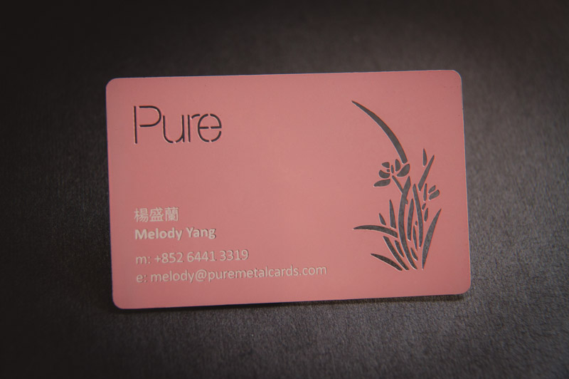 The company has come a long way since their first products, the Pantone Guides, a big number of thin and small cards printed on one side with a series of related colors and then put together in a booklet:-
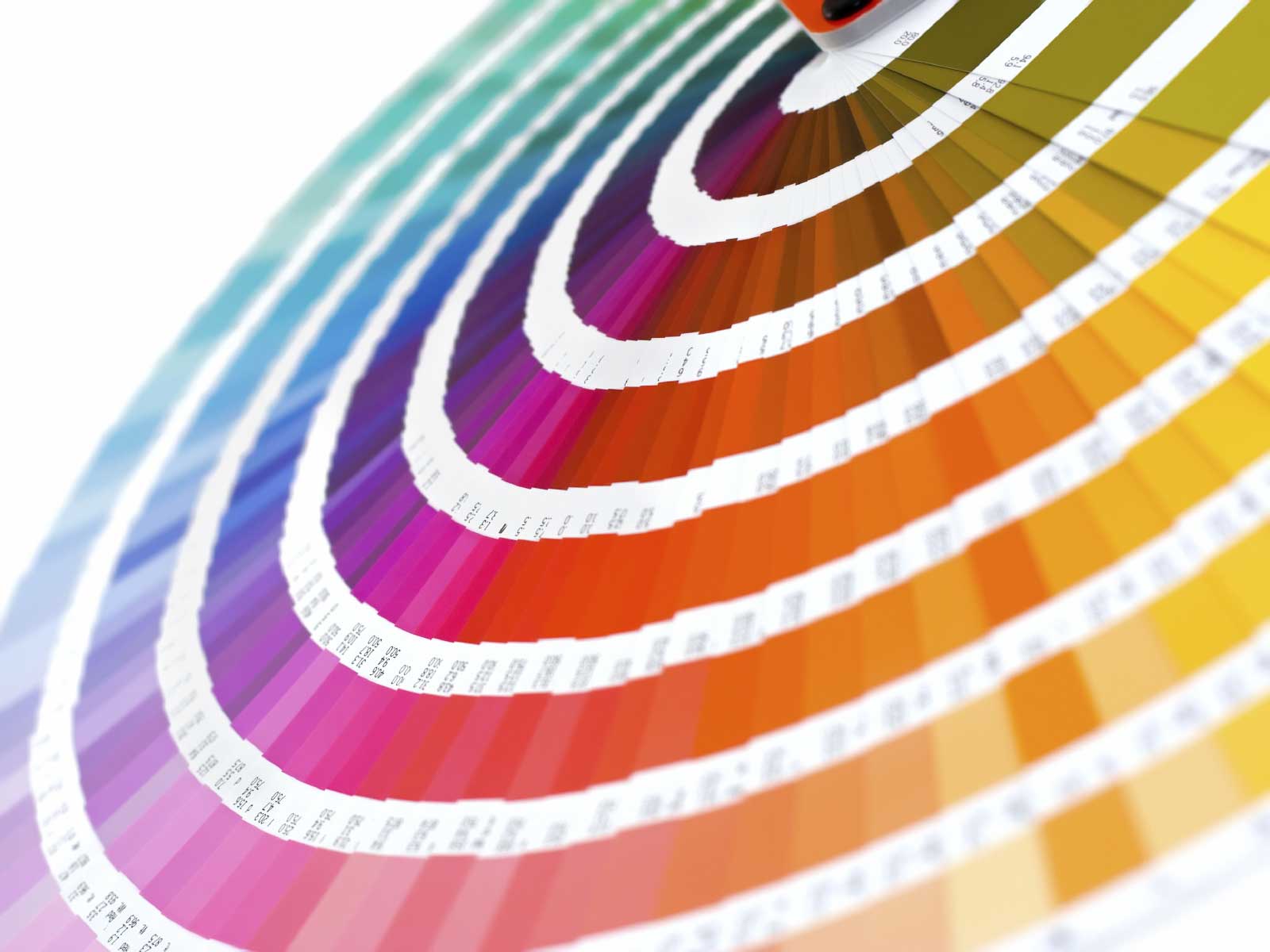 The color of 2013 is Emerald (17-5641), described as “a luminous, magnificent hue, the color of beauty, new life and prosperity.”
 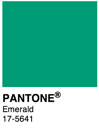 To show how the fashion industry uses Pantone colors to match season trends, have a look at this interesting infographic The Fashion of Pantone by Farfetch. Pantone have just published their Spring 2014 fashion color report from the New York fashion week. A combination of soft pastel colors are predicted to be popular along with “vivid brights”, including Placid Blue, Violet Tulip, Hemlock, Paloma, Sand, Celosia Orange, Radiant Orchid and Dazzling Blue. They claim inspiration from “blooming flowers, travels abroad and strong, confident women” and say that consumers are looking for a “balance of thoughtful, emotional and artistic equilibrium”. Look out for the new Pantone color range for 2014. You can read more here.